Knots - 2014
This is an project that I have continued from an developed theme and built up knowledge I discovered within my Assemblage Project. At the moment, I am practically interested in sculptures has I am not only baffled with techniques and compositions made from the subconscious or spiritual mind but then the concept of making the 'picture mind' physical and being able to touch it.


Monday, 3nd March
London, Tate Modern
I had never been to Tate Modern before... More Infomation and review
The Tate Modern had an inspiring exhibition on for my current interest called 'Poetry & Dreams', It consisted of a multiple amount of different art movements and styles, but the concepts focused mainly on Surrealism were dreams there the source of the artists and poets work. Surrealism strong influence was Freud's theories of the unconscious mind, viewing dreams as an revolutionary force- later interpreting them within their work
Within the exhibition, three artists stuck out to me the most, Joan Miro, David Smith and Alberto Giacometti whom all fascinated me with there sculptures. I felt more drawn to sculptures within this display as I felt integrated to the idea of having a mental thought or dream and make it become physical, 3 Dimensional.
Both Joan Miro sculptures consists of symbolism within abstract and figurative forms. Within his first piece his has labeled it as woman and so represented the female form. Far from the real physical appearance, he has created how he see a woman and within my eye shows elements of the sexual organs and repetitive shapes that appears to represented an half moon at the top of the piece - in history, women have been associated with the moon. His second piece does not label an certain sex but does possess a figurative form. This could represent ever sex but I would lean more towards a woman for the repetitive half moon shapes and a circular form within the stomach of the piece, that could represent a womb.
Joan Miro - Woman 1949
Joan Miro - The tightrope walker
David Smith has represented a house in an unrealistic form with aspects of reality, suggesting an dreamlike house. The piece has an contrast of organic and geometric shapes with elements of sensitive symbolize towards Smith, such as the chain within the centre of the piece. The name of the piece 'Home of the Welder' illustrates himself for he welded the piece and was his profession.
David Smith - Home of the Welder
Alberto Giacometti - Hour of the Trace 1930
His first piece remind me of an house with an oversized satellite. The shell dangling in the middle seem as it was being contained by the house as if to represent it's heart -The heart is where the house is. Giacometti said that when he was making his sculptures he reproduced images that were completely in his minds eye and made them without stopping to ask myself what they might mean. This fragile construction suggests the mysteries of the unconscious, combining space and time, eroticism and death.
Within the second piece it is labeled as 'Woman and Man' deciding the piece to have elements of both sexes. Similar to Joan Miro's Woman, the piece is Giacometti's interpretation of elements that illustrates both the sexes and as join them together within the sculpture.
Composition Woman and Man
Wednesday, 5th March
Paris, The Louvre


Paris, The Louvre
The Louvre is one of the most famous gallery and museum to the classical art world containing traditional and famous art pieces such as the 'Moan Lisa' by Di Vinci. The experience overall was amazing and insightful, having the chance to see iconic artists that have shaped art today. With the louvre only containing traditional styles of art, it was not of a strong influence towards my style of work however I found it resourceful for historical and religious reasons such as symbolism which has been an currant interest of mine from previous projects.
Admiring the works I found myself noticing circles within many forms - almost present in the figurative work and displays that simplified power. Religion and beliefs were strong influences of these pieces and heavily consumed female elements and figures holding or surrounded by circles.
Admiring the works I found myself noticing circles within many forms - almost present in the figurative work and displays that simplified power. Religion and beliefs were strong influences of these pieces and heavily consumed female elements and figures holding or surrounded by circles.
These visual works have aimed my opinion about circles having strong spiritual properties and giving me conreouity to its close relationship with female forms.
Thursday, 6th March
The Pompidou, Paris


Wednesday, 19th March
Planning and Research
Monday,24th March
Tuesday, 25th March
Compositions


 I moved on to experiment with plaster and colour mixing with ink, starting off with emerald green and light. I found once I applied the plaster it acted as a white lighting the colour and creating neutral hues. The plaster dries quickly once mixed, as its temperate rise from the limestone reacting to the water. I placed the plaster within an cardboard block, mixing both colour plasters together that acts the join concepts I wish to communicate. I leaf the plaster to dry over night to become solid and set.


 Pushing on with sculpture work, I created my second plaster block using same technique as the first but adding crushed up pastels to add colour. I chose to work with red and green in both ink and pastels mixing the correct colours together. I did this to hopefully brighten up the colours as plaster was acting as my white. I found that it didn't do put to the end colours whist making the plaster but they maybe a different once it has set and ready to work in. I have left the plaster to set in another cardboard block but I have work at a larger scale, also adding toilet roll tubes to create circlar and create space within the form.


 I began working into my second sculpture using the same techniques has the first but wanted to work into the plaster more, that the original structure of a block can no longer be seen. I found that when this piece was revealed from the cardboard, both plaster colours had set on one side has to create the impression that it had two. In some words, it was a successful accident and made me think about everyone having two sides masculine and feminine no matter their gender - having harmony in one another. I have decided to name this piece Harmony.


 Later on, we visited the cross studio to gather a rough idea of how and what we can display within our exhibition...


 Today, I planned to work on both my second and third sculptures.

.JPG)
.JPG)
.JPG)
.JPG)


 This is my last day to finish of my artwork, ready for the exhibition preparation next week. Using the same technique as my first I created and finished off the last two, Naming my second one 'Harmony' for the harmonious colour relationship with my emotive feeling as I finished the piece and my third 'Bloodstone' name after a bloodstone because of the similar description of being green with red spots that within the stone resemble blood, giving its name and relating my sculpture to an physical body or flesh. When naming, I decided to allow my mind to name it whatever I thought of within the process of making it as like a mother planning it's child's name for when it is born of finished in my case.


 We official decided where our work was going to be placed and spent the rest of the day preparing them to be professional presented. For me, it was about concentrating where on the glass surface I was going to place the plaster and what forms the knots would take against the overall appearance of the sculpture. I wanted the knots to attract the most attention because of the concepts within the piece - so I wanted them to take up most of the surface area. Spreading the laces out. I felt the knots appeared sensitive and delicate especially against the solid plaster, giving the piece another contrast and a sense of emotion from how both pieces effect one another in the joining.


The Pompidou, Paris
The second art gallery I visited was the Pompidou, a post-modern gallery with high-tect architecture and the largest museum for modern art in Europe. I felt my experience was absolutely amazing, encouraging and instinctive for my ideas. Its displays had a widen range of media aiding the contemporary concept of art having endless possibilities. I found interest in almost every piece but for the sack of my research and current influences, I aimed to look at pieces that contained symbolic influences or forms of knots.
One piece that interested me was Tudga's copper and iron sculpture that as symbols of the artists personal mythology and of course knots within it.
Wednesday, 19th March
Planning and Research
To start the project, I created a mind map to gather all my interests and influences from my visits. I found I have continued influences of Knots from my previous projects and motived by the idea of producing art work focused around Knots, joining or holding relationships. Discussing my interests, hand fasting was suggested to me to research, as it is an rival or practise that involves a knot/knots to join a man and woman within marriage which could be a influence. Doing some research, I was intrigued to find that the practise sympathised a spiritual joining that would be made through the physicality of a knot - the idea of the physical becoming spiritual.
Website explaining the Celtic knot meanings - http://www.whats-your-sign.com/celtic-knots.html
Hand Fasting - http://www.youtube.com/watch?v=8xis0ocfOIQ
Later on, I went to speak to the ceramic technician Lynn, to talk about her Hand-fasting experience within her marriage and what it meant to her. She went though with me the whole process and even made her own band/rope for the service/rival. She said that the rope was made up of three bands as three bands makes up the most strongest knot. The bands also represented three reasons why she married and excepted from marriage with personal charms attracted. This practise is from the Pagan religion and so would be interesting to find other similar practises and opinions from other religion to see there take on it.
Later on, I went to speak to the ceramic technician Lynn, to talk about her Hand-fasting experience within her marriage and what it meant to her. She went though with me the whole process and even made her own band/rope for the service/rival. She said that the rope was made up of three bands as three bands makes up the most strongest knot. The bands also represented three reasons why she married and excepted from marriage with personal charms attracted. This practise is from the Pagan religion and so would be interesting to find other similar practises and opinions from other religion to see there take on it.
Monday,24th March
Tuesday, 25th March
Compositions
Today I chose to do quick composition of my symbolic language towards men and woman. During the process I thought of their individual personalities/characteristics and interpreted them though shape as well as thinking about my minds imagery with my experience and feelings. I tried to prevent myself from thinking about the physical body, drawing my thoughts internal shapes. I see woman as soft shapes as to intemperate a woman's curves but also there soft nature with a man as hard shapes to intemperate there strength and bold characteristics.
Woman Man
I then started to combined both of the compositions elements imaging this joining. Preparing myself for this I couldn't bring myself to do this without involving the three cords/strands that have been referred many times in my research of marriage. I represented them in different ways but as I made the marks to represent them I made them so that they were influence by the three; Man straight and bold, Woman soft and curly and the last being the one to join them or seen as God.
Description - Within the first composition of the three (the left image) I placed Man and Woman lined next to each other, Man being the far right line; straight and thick with the woman slightly different having a bit of an curve within it. The last line wrapped around them I used this to symbolise God, holding the couple together and has triangles to show masculine elements - Reflecting now I would them the last line thicker and Bigger.
Both these images are the combining of both the Man and Woman with the last Strand (God or the holding) representing Marriage
Later on I decided to invest in some Das which is an plaster substance great for sculpting and mounding. This plaster is an fast dry plaster, giving me the opportunity to make quick and simple structures experimenting with the forms and shapes of my 2 Dimensional compositions in an sculptural and physical way - continuing my process and concept of exploring my internal, pictorial, spiritual images and making them physical. First of all, I chose to create the sculpture idea I made yesterday of an knot made with the idea of an triangle and circle.
I wanted to produce a piece that created flow from one end to another as to separate both sides using sharp and soft shapes to define the two - defining both sexes.
I later felt the need to produce a continuous knot plaster piece, to understand and learn the structure of a endless and unbreakable knot. It's form as no beginning or end and so has in my mind, contains this spiritual concept of always being.
Wednesday,26th March
This morning I had a talk with my tutor about my influence and my current work with what I wish to achieve. With comments made, I have became more influence with the idea of interpreting bible text in my work as I realised it was the Christian teaching I was often referring to, especially verses from the bible that describe marriage spiritually and physical such as...
Mark 10:8 'For this reason a man shall leave his father and mother, and the two shall become one flesh; so they are no longer two, but one flesh'
 I felt within this talk that my true opinions of marriage were becoming continuous, having the desire to represent marriage as an irreversible process presenting this in an biologic concept, were bodies literally becoming one in one another, as to separate could lead to metaphorical 'death' - at the same time having mental images of conjoin twin aiding this thought process.The idea is to use hands to represent the body, a man and a woman's; positioning them interacting with one another, 'not by choice'. This is an quick sketch of the idea.
Mark 10:8 'For this reason a man shall leave his father and mother, and the two shall become one flesh; so they are no longer two, but one flesh'
I felt within this talk that my true opinions of marriage were becoming continuous, having the desire to represent marriage as an irreversible process presenting this in an biologic concept, were bodies literally becoming one in one another, as to separate could lead to metaphorical 'death' - at the same time having mental images of conjoin twin aiding this thought process.The idea is to use hands to represent the body, a man and a woman's; positioning them interacting with one another, 'not by choice'. This is an quick sketch of the idea.
Alginate Tutorial - http://www.youtube.com/watch?v=O3Ow2FAWvKI
Epoxy Resin Glue Tutorial - http://www.youtube.com/watch?v=dyo97JZuCL8&safe=active
Epoxy Resin Glue Tutorial - http://www.youtube.com/watch?v=dyo97JZuCL8&safe=active
I could simply achieve this idea using Alginate to create a mound of hands combine but the technique is more of a craft than art. I wish to achieve the same concept through symbolism to represent Man and Woman instead of the figurative form.
Thursday, 27th March
If I chose to go down the line of making my own hand-fasting knot, I need to know the common or traditional materials I should work with. Researching, I found a range of materiel I could use, some easily able to work into whist other such as an hard material as rope, would be a challenge to transfer marks on; Rope, cloth, grass plait, cowrie shell plait, String,Buddhist Rosary,Prayer Stole.
Handfasting Research - http://www.ehow.com/how_4473083_incorporate-handfasting-ceremony-modern-wedding.html
Handfasting Research - http://www.doityourself.com/stry/handfasting-rituals#b
Tuesday, 1st April
Continuing to produce compositions to build up my visual symbolic refers of a man and woman, I choose to develop it further through colour. Colour has already been associated to a particulate gender, however I wanted to explore my opinion and response to a colour or hue.
I began with just the primary colours red, blue and yellow. I felt that I had a strong and defiant opinion of red being masculine because of it being an dominating colour, associating it with with a male's strength; strong and over powering. I did felt that the colour red has elements of both sexes which I agree to be true for all colours, determined by their tone and temperature of it's hues; vibrant, dark or warm reds were masculine whist cold and light red/pink feminine.
Woman Man
I choose not to experiment with blue as I felt it was equal on both sides of the sexes because of it's association to the sky and heaven, spiritual value. Yellow was the hardest to define because of it's my association of it to light which seems equal however I definitely decided it was masculine for the same reasons as red with warmth and tone values as well as it reminding me of gold - gold being the highest and first place medals as man were say to be created first.
Wednesday, 2nd April
Today I focused on creating female compositions, working with soft and round lines, shapes and cold colours. I strongly agree with green and purple being feminine because of the greens connection with mother earth and purple being a misical colour linking with witches. I even applied blue which I thought to have been an equal and neutral colour between both sexes.
When I look at yellow I feel like its alive and has aspects of representing life, so it is within both Man and Woman. Part from blue, yellow was the most difficult to define and uncomfortable on my eyes as I have visual problems with this colour. To me, yellow appear to be the sun on a paper, making my eyes work more strenuously and making this stronger association to a light. As an aid and contextual research, I refereed to my previous colour project to explore other symbolic refers.
Thursday, 3 April
My continuous battle to define colours started to take away my natural instructive response to a colour, in other words not allowing the colours to breath. Today I choose to step back and rethink my approach towards my compositions and colour chose. I decided to go with a method of simply mixing colours with little thought of separating the colours and go with my instructive thought at the end of the mixing. Using this method I finished off my second woman exploration composition.
Woman II
Whilst doing the practise of mixing, I recorded my responses within my sketchbook to develop a my visual symbolic colour alphabet of the sexes. I found this more relaxing and insightful towards myself. My response was not define purely on if it was more feminine or masculine, but what characteristic or emotion it create or had the impression of. I then instructively associated the characteristic to ever sex and made my own chose from there. Here is a basic founding of my colour groups...
- Feminine - Purple, Violet, Green, Pink/ Deep Red, Faded / light yellow, light blue,
- Feminine - Purple, Violet, Green, Pink/ Deep Red, Faded / light yellow, light blue,
- Masculine - Orange, Red, Yellow, Dull yellow, Black, Deep Blue
Both - Blues
Having finished my colour platelet for woman, I choose to create another composition to test it.
again with Man.
Monday, 7th April
Still influence with the idea of hand fasting and what I learn from Lyne, I decided to play with the idea and create my own rods using lace and having charms in it made from plaster that symbolizes both sexes.
I moved on to experiment with plaster and colour mixing with ink, starting off with emerald green and light. I found once I applied the plaster it acted as a white lighting the colour and creating neutral hues. The plaster dries quickly once mixed, as its temperate rise from the limestone reacting to the water. I placed the plaster within an cardboard block, mixing both colour plasters together that acts the join concepts I wish to communicate. I leaf the plaster to dry over night to become solid and set.
Tuesday, 8th April
First thing in the morning, I ripped away the cardboard from the plaster and ordered some plaster tool to be am to engrave into it in the future. I will be engraving both masculine and feminine shapes to encourage there being within the piece.
Wednesday, 9th April
Experiment more with compositions, I chose to begin combing both masculine and feminine shapes and colour. I paired the shapes with there associated colour, I did this also within old compositions, working back into them building up series to work with and learn from.
Thursday, 10th April
Pushing on with sculpture work, I created my second plaster block using same technique as the first but adding crushed up pastels to add colour. I chose to work with red and green in both ink and pastels mixing the correct colours together. I did this to hopefully brighten up the colours as plaster was acting as my white. I found that it didn't do put to the end colours whist making the plaster but they maybe a different once it has set and ready to work in. I have left the plaster to set in another cardboard block but I have work at a larger scale, also adding toilet roll tubes to create circlar and create space within the form.
Tuesday, 22th April
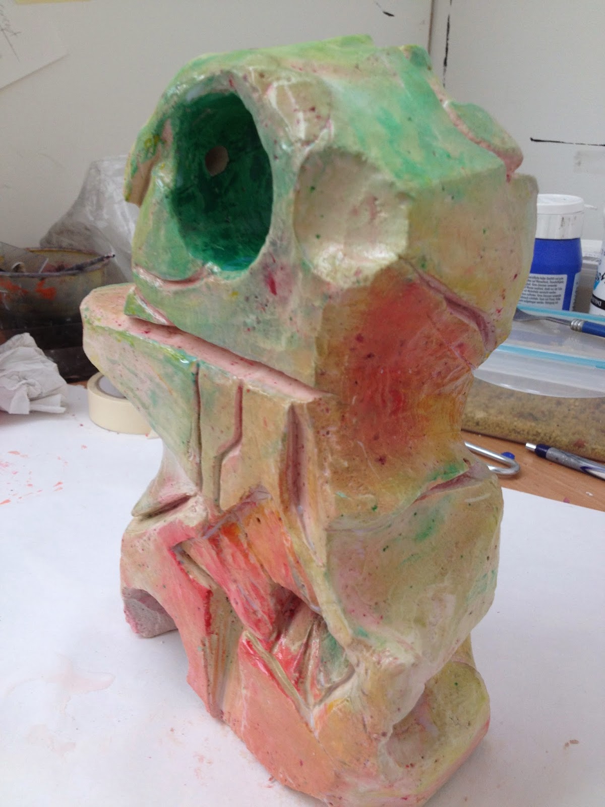
Today I finished off my first sculpture and decided to name it 'Goldenrod' - named after a yellow flower which it reminded me of its natural and organic elements it has. I made a hole within the piece, so that I could place a knot around it. I used a lace and dried it in the same inks as the plaster to encourage and create a subtle appearance between both the plaster and lace - making a connection.
Wednesday, 23th April
I began working into my second sculpture using the same techniques has the first but wanted to work into the plaster more, that the original structure of a block can no longer be seen. I found that when this piece was revealed from the cardboard, both plaster colours had set on one side has to create the impression that it had two. In some words, it was a successful accident and made me think about everyone having two sides masculine and feminine no matter their gender - having harmony in one another. I have decided to name this piece Harmony.
Working into the plaster, I have decided I wanted to add more colour to the piece, choosing to rub ink and paint over its surface whilst the plaster was still wet. This made it easier for the colours to set within the piece onces its dry. I found that once I applied the colours, they were too vibrant and so i choose to scrap back areas - working over it to create various much of lighter tones and hues with slight vibrance. Once I felt it was ready, I applied glaze too make it appear professional.
Thursday, 24th April
Later on, we visited the cross studio to gather a rough idea of how and what we can display within our exhibition...
priming the walls...
In the evening, I created my third plaster piece which differ from the first two, as I chose to experiment with acrylic paint as well as inks to achieve a more vibrant and block hues. I did this to create interest between the sculptures but also as a form of play to see how it will turn out.
Monday, 28th April
Today, I planned to work on both my second and third sculptures.
Tuesday, 29th April
Along side my sculptures, I felt the need to have illustrations of them being knotted shapes and started to develop compositions from my previous soft and hard edge shapes.
Wednesday, 30th April
Continuing my illustrations, I moved onto stretched paper, at a larger scale of A1 were I would work at an A2 size within the centre of the A1. I chose to do this so that the large amount of white area would complement the knot and make the hues more vibrant and present its true potential. Aiding its appearance, I brought two A1 size sliver frames to present my final chosen illustrations for the exhibition. This will give them a more professional and appealing look within the show.
Friday, 2nd May
This is my last day to finish of my artwork, ready for the exhibition preparation next week. Using the same technique as my first I created and finished off the last two, Naming my second one 'Harmony' for the harmonious colour relationship with my emotive feeling as I finished the piece and my third 'Bloodstone' name after a bloodstone because of the similar description of being green with red spots that within the stone resemble blood, giving its name and relating my sculpture to an physical body or flesh. When naming, I decided to allow my mind to name it whatever I thought of within the process of making it as like a mother planning it's child's name for when it is born of finished in my case.
Monday, 5th May
Today is the first day of setting up our exhibition. The first job was to gather up all the artwork we wish or may wish to display and transport it to the gallery where we would later decided if or where we wanted it. I spent this time placing two of my most favoured or development works into my sliver frames were they would be protected within the travel and later cleaned.
At cross streets, we started to discuss where it would be practical to have the artworks. This was the most challenging part as we wanted to create a flow within the show, connecting all our work together, having an easier and a more appearing nature for the viewers. We were able to decide roughly from scales of work and forms such as my sculptures or painting to determine where work was placed, having help from professorial and skilled artists Steven Heaton and David Stanley from the studio. To avoided stress and enjoy the experience we took this task slowly, giving ourself time throughout the next days to finalize our decision.
Tuesday, 6th May
We official decided where our work was going to be placed and spent the rest of the day preparing them to be professional presented. For me, it was about concentrating where on the glass surface I was going to place the plaster and what forms the knots would take against the overall appearance of the sculpture. I wanted the knots to attract the most attention because of the concepts within the piece - so I wanted them to take up most of the surface area. Spreading the laces out. I felt the knots appeared sensitive and delicate especially against the solid plaster, giving the piece another contrast and a sense of emotion from how both pieces effect one another in the joining.
Wednesday, 7th May
Tomorrow night is our opening exhibition night and so the last preparations had to be made such as cleaning and display work. The last remaining displays work were printouts, to be presented next to our work, giving information. These were the pieces labels having their names, medians used, prices and the artist who created them. They were professional mounted with foam board and placed in level with the centre of the piece or eye level of the viewer which is efficient at Art galleries.
For each of us we also place a printout summary of our work to produced more information. This printout is one of most imporants as it details why an veiwer may of found appeal, giving them an understanding how and why artists have created there work - making them appricate and find enjoyment.
We also chose to have a display book to give the exhibition a various amount of different types of displays to create interest within our visitors. The book contains prints, my being from my previous project that influence my current work - the idea it will show the visitor my development.
Our Exhibition

Thursday, 8th May
The night was amazing and built up my confidence within my work from the support and comments made. The experience was insightful; learning how to communicate my work visually and orally in a professional manner. Already having much experience visually, it was challenging to have confidence in myself to speck about my work but I felt I had achieve it quite well. It was much easier for me with the fact that my conversations were informal and so hopefully, with more experience, give me the knowledge and greater confidence to be able to be speck in formal discussions in the future.
During the night, we had an comments book for our quests/visitors to leave comments for us to reflect on and bring a greater sense of accomplishment towards our efforts and work. The comments were all positive and some quite detailed describing how they sympathized with are work and felt an connection.
As an summary of my work, I truly fell I have been successful in my research and discover of what defines the sexes but also what I have learnt defines me. My experimentation with plaster as only really begun and will be experimenting in the future as well as working with and against organic and geometric forms.
I still feel influenced by relationships or opposites and feel my next step is to develop further with my self-knowledge and spiritual fulfilment through creativity.
This is an image of myself and my colleagues at the gallery before the show which as been used for advertisement purposes and printed into the Wigan Newspaper.
No comments:
Post a Comment